Scott McCloud and Dan Berry talk about how Scott got into comics, the artistic potential of comics, getting the urge to do something and letting his story The Sculptor incubate for 30 years. The Sculptor is out on the 3rd February from First Second in the US and Self Made Hero in the UK.
Blog
Daniel Merlin Goodbrey
Daniel Merlin Goodbrey and Dan Berry get together to talk about interactive comics and hyperfiction, incorporating sound into interactive comics and Sonic the Hedgehog.
Transcriptions are here!
Big news! I’m delighted to say that new episodes of the show are going to be transcribed by the amazing and very talented Renée Goulet. To see her in action, check out the transcript of the interview with Christopher Butcher.
Why is this big news? It means that the interviews and the many varied nuggets of wisdom, mirth and advice that they contain are going to be available in a more flexible format to a wider audience, not just people that do or can listen to podcasts. It means that they are a resource that will be searchable, accessible, quotable, easy to reference, share and fairly straightforward to mangle into a different language through something like Google Translate. It means the podcast has evolved into something more useful to more people than ever before.
This is all made possible thanks to the people who donate to the show through Patreon. It would simply not happen without financial support from the community that Make It Then Tell Everybody serves. Transcribing audio is not cheap, and when you have a back catalogue of audio interviews 3 or 4 days in length to transcribe, it is restrictively expensive for me.
At present I can only really afford to get new episodes of the show transcribed. I want to set Renée to work transcribing the back catalogue, so please head to the Patreon site for the show and sign up to donate a dollar or two per episode to help us do this. I need you. If everyone that listened donated one dollar per episode, it would financially cover the cost of transcribing everything many, many times over. It doesn’t take everyone, it’d only take a tiny proportion of Make/Tell listeners to make this work, and a modest proportion of listeners to make it a roaring success! Strength in numbers! Get enough tiny droplets and you have a whole ocean! If Patreon isn’t your thing, or you want to make a one-off donation, you can do so here through Paypal.
I know that this is something that not everyone might be in a financial position to do, so instead perhaps help spread the word. Telling people about the show and what we are trying to do is just as valuable to me.
I’m so proud of the podcast and I am so excited about what the coming year is going to bring.
Dan Berry
Dan Berry gets the interview tables turned on him by Hannah Berry (no relation) and talks about getting into comics, his creative process and the Bristol scale.
Josh Bayer
Josh Bayer and Dan Berry get together and talk about art school, intuition and changing the conversation you have with yourself.
Hope Larson
Hope Larson and Dan Berry talk about getting into and out of comics, burnout, writing stories and the parallels between directing film and making comics.
Kevin Huizenga
Kevin Huizenga and Dan Berry talk about rituals, creativity and process.
Check out the Patreon campaign and help support the show!
Jess Fink
Jess Fink and Dan Berry talk about autobiography, erotica, getting work done, developing a process and drawing with confidence.
Check out the Patreon campaign and help support the show!
Darryl Cunningham
Darryl Cunningham and Dan Berry talk about the comics crash of the 1990s, the links between creativity and self esteem, research and the allure of divisive topics.
Vera Brosgol
Vera Brosgol and Dan Berry talk about getting into, out of, and then back into drawing, storyboarding & storytelling and the idea of who you work for.
Jillian Tamaki
Jillian Tamaki and Dan Berry talk amongst other things about ideas, the evolution of a style and faith.
Check out the Patreon campaign to help support the show!
Cathy G Johnson
Cathy G Johnson and Dan Berry get together to talk about ideas, the creative process, “romance”, curating an event and how seductive images can be.
Check out the Patreon page and help support the show’s production.
Neil Slorance
Neil Slorance and Dan Berry sit down to talk about process, working with a writer, reviews and being part of a creative community.
Check out the Patreon page for the show! Donate a dollar or two per episode to help support the show’s production.
The Same Faces pt.1
I get asked questions occasionally about the process of making comics. I’ve passed this particular question on to a handful of the people I’ve interviewed for them to answer, and I’ll post up more as they come in.
How do you make the faces look the same from panel to panel?
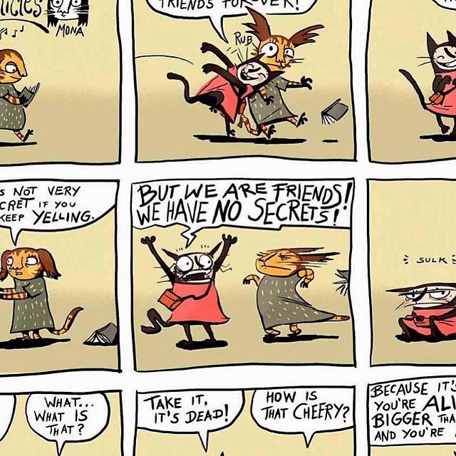
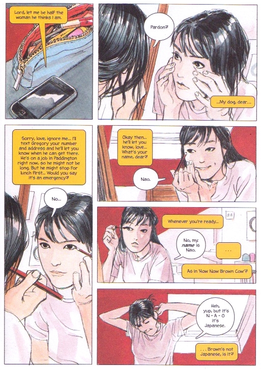
I remember this being a big concern of mine when I started drawing comics, and I get asked this pretty frequently. Probably more of a concern that actually telling a story if I’m honest. I think this is a question that gets asked a lot because it is so apparent when the characters don’t look consistent. Here’s how John Allison, Viv Schwarz, Glyn Dillon and Sarah Glidden tackled this topic;
John Allison (Listen to his interviews here and here)
I’m not sure I ever worked this out in a scientific way. When I was a kid, I drew Transformers comics, and because I was a kid who liked the toys, I knew where all the different bits of their faces went. Optimus Prime had that barn door over his mouth, Jazz and Blaster had visors over their eyes, Shockwave had a hexagon head. Their blocky appearance made getting all those bits in line easier.
I think that’s still what I do. I know what shape a character’s face is, what shape their nose is, what kind of eyes they have, and I put them in the same place each time. And I know that if I don’t properly work out a new character today, and try to draw them several times in the same comic, they don’t look the same each time. It’s not magic, you just get better at copying yourself.
Viv Schwarz (interviewed here and here)
Good question.
I draw my characters without worrying too much beyond a simple set of rules about their individual proportions, concentrating more on their stance and expression. Then I check all the drawings, comparing them carefully and correct them in Photoshop where they are too far off.
I allow myself some room for variation because my characters tend to be a bit amorphous, their whole shape changes with emotion and their features wander a bit – that’s what I’ve observed happens in animals where feathers, fur or loose skin allow for a lot more expressive shape shifting. I am allowing that for my human characters to some extent as well because I think it reads just fine. I’m also making all the characters in any given story look quite different so that they are easy to recognise even if their shape varies a bit.
I couldn’t keep the faces completely consistent anyway because I myself can’t recognise real people by their features and have to memorise their voice, smell, stance, hairstyle and so on instead. I think that actually helps my drawing more than it hinders.
Glyn Dillon (Interview here)
Woodrow Phoenix
Woodrow Phoenix and Dan Berry talk about the shape of stories, typography, pushing the boundaries of what you can do with comics and an enormous book that you can not buy on Amazon.
Be sure to check out the Make/Tell Patreon campaign and consider donating a dollar or two per episode to help in the production of the show.
John Porcellino
John Porcellino and Dan Berry get together to talk about 25 years of King-Cat Comics and Stories, punk rock, style, sickness and health. John also has a new book coming out imminently from Drawn & Quarterly entitled The Hospital Suite and a US tour, so check both out quick as you can!
Also check out the Patreon campaign to help support the show. Every one of your dollars helps in the production of this show a great deal.
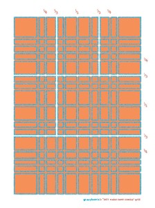
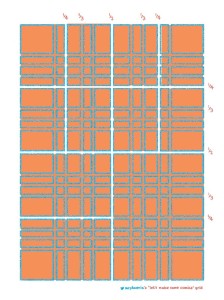
Woodrow Phoenix on The Grid
Patrick Kyle
Patrick Kyle and Dan Berry talk about self publishing, risographs and dream logic. Patrick’s book Distance Mover is out from Koyama Press in September.
Jesse Jacobs
Jesse Jacobs and Dan Berry’s conversation about process, stories, sketchbooks and wilderness confection is made all the more dramatic by being recorded during a booming thunderstorm.
Help support the podcast with your hard earned dollars on the show’s patreon page!

